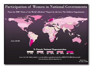
Saturday, December 6, 2008
Saturday, November 15, 2008
Lab 10
Monday, November 10, 2008
Lab 9
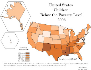 This is a color version of Lab 7. The color versions, both hard and soft copy, display better than the grey scale version from Lab 7. To contrast the hard and soft copies, the printed version shows greater color changes. Specifically the two darkest colors on the hard copy are contrast more than when posted in the blog. However the two lightest colors contrast more with eachother than in the digital version. The lightest color on the digital version almost appears white whereas it is more tan on the hard copy. The only difference I would make, now that I can see the hard copy, is I would make the lightest color a little darker so as to not appear so white when seen on the computer screen.
Saturday, November 1, 2008
Lab 8
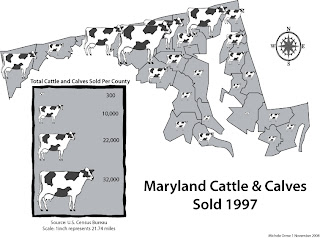 This was a lab on proportional symbols. We pretended that the state of Maryland asked us to create a grey-scale map (we haven't had our color lesson yet) depicting the relative density of census data for each county. In a proportional symbol map, a symbol (cow) is scaled to various sizes to depict the relative magnitude of some value. Proportional symbol maps scale symbols to continuous sizes. Graduated symbol maps only scale symbols to discrete sizes.
Tuesday, October 28, 2008
Lab 7
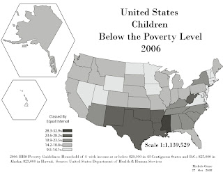
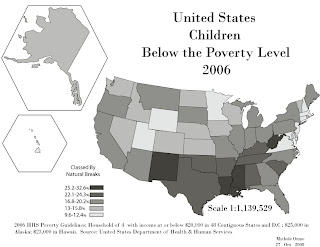
Lab 7: Grayscale Choropleth Maps of the 50 States
Comparison of Natural Breaks and Equal Interval
The map classed by equal interval gives an impression at first glance of a split between northern and southern states and shows a clumping of southeastern states. The natural breaks classified map appears more diverse. If I were to really use Natural Breaks I would have split it into many more categories but was limited to five for eye ease (especially since we were told to create the map in grayscale).
Choropleth Map
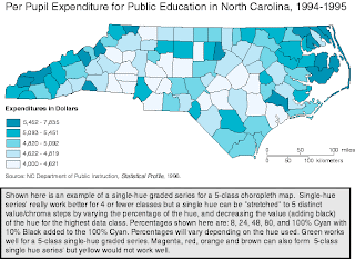 This is an example of a choropleth map courtesy of http://personal.uncc.edu/lagaro/cwg/color/Choro5-SingleHueGood.gif
Subscribe to:
Comments (Atom)


