Tuesday, October 28, 2008

Lab 7


Lab 7: Grayscale Choropleth Maps of the 50 States
Comparison of Natural Breaks and Equal Interval


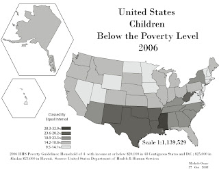
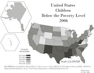
The map classed by equal interval gives an impression at first glance of a split between northern and southern states and shows a clumping of southeastern states. The natural breaks classified map appears more diverse. If I were to really use Natural Breaks I would have split it into many more categories but was limited to five for eye ease (especially since we were told to create the map in grayscale).


Choropleth Map

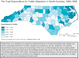
This is an example of a choropleth map courtesy of http://personal.uncc.edu/lagaro/cwg/color/Choro5-SingleHueGood.gif

Friday, October 10, 2008

Lab 6

This is a Dot Map. The idea was that the Census Bureau was interested in creating a map depicting the distribution of Veterans in West Virginia. I was provided a data file that didn't indicate a year the data was collected so I left it off of the map. According to our lab assignment and text book, Dot maps are used to provide a visual impression of relative density.

Thursday, October 9, 2008

Dot Map

Commercial Wireless Antennas in the USA
Courtesy: http://personalpages.manchester.ac.uk/staff/m.dodge/cybergeography/atlas/wireless.html

Lab 5

This is the lab on creating boundary files for Illustrator and Making a Map. I found it helpful to only export one map from ArcMap instead of two and then flatten it in Adobe Illustrator so you're only moving one map around instead of two.